Weekly Flaws
This week: CosMc's logo looks like it was an AI rush job, Hello Kitty is a McD's employee now, cat-themed rice fields, Teams is horrible, and be careful when filling up your tank.
January 5, 2024
Welcome to the weekly newsletter from Design Flaw! I’m Not-Comedian Matt Rife, a graphic and UX designer who also happens to be interested in a lot of different things. The idea behind Design Flaw is to highlight some of the oddities and questionable (or just bad) decisions that go into the products and services we all use, while also showing how good design and content can make your own products better.
In addition to the weekly ephemeral roundup I’ll be writing longer-form articles on design and business and how good design can make your business better. I’ll also be hosting guest writers from time to time for fresh perspectives on a broader range of topics. All content is free but subscriber-only, so be sure to subscribe to get access to everything.
I’m currently working on some articles on how to find your audience (hint: it’s not “everyone”) and why design is way more than just making things look good.
So check out this week’s “news” below and be sure to subscribe to keep getting updates when new content drops. I love getting feedback so feel free to send your thoughts, suggestions, and article requests to flawed@designflaw.media.
Oh and if you’re wondering about my take on the Comedian Matt Rife drama then go check my interview with Cracked.com.
CosMc's Logo Looks a Little Weird
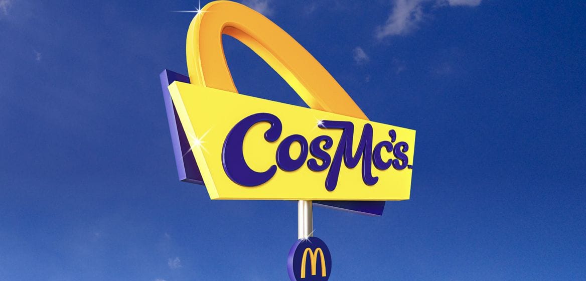
You’ve probably already heard that McDonald’s has resuscitated an obscure 1980s-era character in the form of a new energy-boosting-drink focused chain. (NPR has a good rundown if you are somehow not aware of this.)
Details are scarce and I haven’t been able to track down who did the brand work, but Creative Bloq talked with Craig Burston, a senior lecturer in Graphic and Media Design London College of Communication. Burston had this to say about the logo: “You could say it’s refreshingly oppositional, but it’s not at all well-drawn, particularly typographically. It feels AI-generated, as though something were not quite right. It feels like algorithmic graphic design, not super smart minds playing games with corporate aesthetics."
To be fair, the corporate-provided images certainly seem to be 100% AI-generated, so perhaps the real deal will look a little better. That said, I don’t know that it’s all THAT bad and I doubt the intended audience is overly concerned about kerning. The whole concept is based on a sort of retro-futurist vibe and I definitely get that from what branding is available and am interested to see how the actual stores look.
“It feels AI-generated, as though something were not quite right. It feels like algorithmic graphic design…”
The first CosMc’s location is opening in the Chicago area, so maybe I’ll be able to slip away from the cornfield to give it a try - in the spring when it’s not a thousand degrees below zero.
Hello Kitty Now Works for McDonald’s
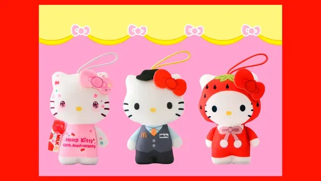
Speaking of McDonald’s, in Japan Hello Kitty is for some reason celebrating her 50th birthday by getting a job at the fast food chain. I have no idea why she’d do that, but the promotion was very popular with the public and ended up being much shorter than planned after the Happy Meals toy supply ran out. (Naturally, there have been accusations of speculators scooping up the adorable toys, but that's the world we live in.)
To be fair, McDonald’s Japan was trying real hard to hire housewives a few years ago, so perhaps hiring girls who look like cats (but evidently aren’t cats) is the new trend. Let’s just hope they are paying her a living wage, at least.
(There is also a super-cute collar with McDonald's Indonesia.)
Speaking of Cats (that Also Aren't Actually Cats)
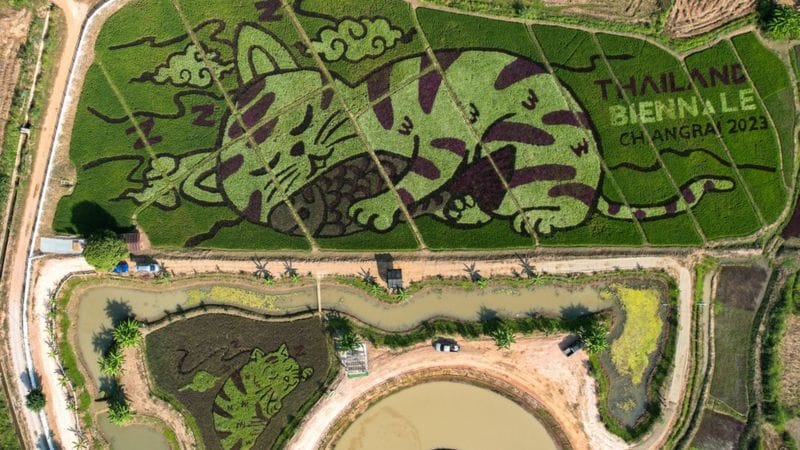
Elsewhere in Asia, Thai farmer and artist Tanyapong Jaikham got 200 volunteers to help him plant various types of rice in order to create field-sized cat images. I can barely figure out what to have for lunch most days, so I can’t imagine making a project of this scale actually work. The result is amazing and seems fitting for the Thailand Biennale, which is open through 24 April 2024.
What the Hell is Wrong with Teams?
I don’t know if, like me, you have the misfortune of having to use Microsoft Teams, but I feel sorry for you if so. I’ve used Teams off and on for a few years and it’s mostly been fine. Like most Microsoft products, it seems to incorporate just a few too many features, some of which work in unexpected ways. And by “unexpected” I don’t necessarily mean “delightful," but that's a topic for another day.
But over the past few months, Microsoft has rolled out a new and theoretically improved Teams and things have been...not great. I’ve personally had Teams completely hang up when ending a screen sharing session, as have some of my colleagues. And by “hang up” I mean “kill all the Teams processes, restart it, and then rejoin the meeting you were just unceremoniously ejected from.”
I thought it might be a Mac thing, but a few days later I witnessed another person having this same issue with Windows 10.
But that’s not all: there seem to be an ever-growing number of annoying problems including, but not limited to audio not working in meetings, thus requiring the person to dial into the meeting via phone, notifications not appearing, or appearing late, and the ever-popular crash.
Overall, Teams is a pretty solid product, but I’m getting the sense that Microsoft may want to consider holding up on some of the 50 new features and do a few code review/bug fix sprints.
Spark, and It's Like Gasoline I Start Burning Your (Diesel) Machine
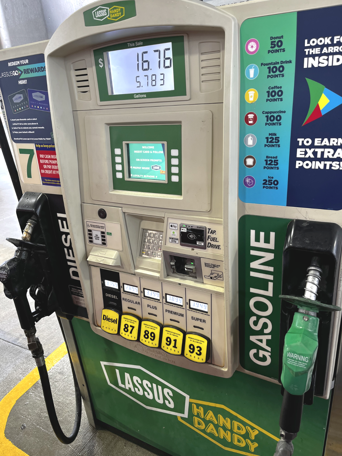
Every now and then I run across some weird gas pump layout/configuration choice and it happened again recently. I pulled up to a dual-fuel pump and lo, the gasoline handle was green. Generally, diesel pump handles (and often caps) are green—except when they (obviously) aren’t. This seems to be a branding thing for Lassus, and BP seems to be guilty of the same.
Should people be careful to avoid mix-ups? Sure, but people make mistakes and there are any number of things, like being tired, in a rush, dealing with an angry kid in the car seat, or just talking to the guy at the next pump that could cause someone to grab the wrong handle.
Ideally, there would be some federal-level regulation on this, but don’t hold your breath. So the folks who have a say in these decisions – I’m looking at you, brand people – should stick to the de facto options. Or failing that, just make all the handles black.
And for everyone else, let this be a reminder to always read the label on the handle AND the button before fueling.